Cosmetic bottle configurator: options and the dependencies between shape, glass, content, closure and label
A bottle configurator's options and how they depend on each other: shape and label area, glass and print colour, content and label, closure and opening.
Short answer: a bottle configurator looks like a list of independent options, but it has dependencies. The bottle shape sets the label area, the glass sets the colour of a screen print, the content sets the product line on the label, and changing the closure resets the open state. Write these rules down before the build and every combination looks consistent.

Which options does the bottle in our example configurator have?
The product is a fictional serum bottle and every value is an example value. No manufacturer commissioned or reviewed the demo.
| Option | Values | Default |
|---|---|---|
| Shape | Round, square | Round |
| Glass | Clear, frosted, amber glass | Clear |
| Content | Rosé, amber, clear, sage | Rosé |
| Closure | Dropper, cap | Dropper |
| Closure finish | Brushed gold, matte black, oak, gloss white | Brushed gold |
| Brand name | Free text, up to 14 characters | A fictional name |
| Label | Paper + foil, screen print | Paper + foil |
| Open | On, off | Off |
Glass, content, closure, finish and label give 192 combinations per shape. None of them is excluded. The dependencies in the demo change the appearance; nothing is excluded, and only the open state is reset when the closure changes.
Which dependencies link the options?
Shape → label area
Round and square are not two models. The bottle is a single, mathematically described shape that morphs from round to square in a little under a second. Each shape has its own label area, and the label follows. For your range this means every bottle shape comes with a defined label area, which your prepress team already knows.
Glass → screen print colour
With screen print straight on the glass, the print colour follows the glass: light on clear and amber glass, dark on frosted glass so the text stays legible. That is a design rule of the demo. In a project, your own rule goes here: which print colours you offer on which glass.
Content → product line on the label
Each content colour stands for a fictional product with its own line on the label, for example a face oil for amber. When the content changes, the label is redrawn. The example shows how a variant and its labelling can be coupled.
Closure → open state
When the viewer switches the closure, the demo closes the bottle and drops the new closure on from above, so an open state with the wrong closure cannot occur. Opening unscrews the closure by 1.6 turns along the thread, lifts it and moves it beside the bottle: the cap is set down next to it, while the dropper stays raised and a drop forms at its tip at the end.
Finish → camera
Changing the closure or its finish moves the camera to the closure; a new brand name or label type moves it to the label. The change is in view at once, even if the viewer was looking at the back.
How is glass rendered in the browser?
The demo traces each view ray through glass, air, content and the dropper tube. It calculates refraction, reflection, total internal reflection and absorption in glass and content. Clear glass therefore looks slightly green along long paths, such as the 2 cm base, and amber glass looks dark. The back of the label is visible through the glass.
This is demanding. It is the demo's own solution, not the default of a web 3D format. In a project we check how much of it your product needs and which devices your visitors use. Data preparation for packaging, including the simpler glass option, is covered in implementing packaging in 3D; the general route from CAD files to the web in CAD to a web 3D configurator.
How do you write the rules down for your range?
For a bottle viewer, one table per bottle family is usually enough:
- Shapes with fill volume, dimensions and label area.
- Glass types, and which shapes come in which glass.
- Closures per neck finish, with their finishes.
- Label and print types, and on which glass they are offered.
- Exclusions: combinations you do not supply.
Exclusions are where a viewer becomes a configurator. The demo has none; your range almost certainly has some, for example a closure that fits only one neck finish. Keep them as reviewable data, not hidden in code.
What is the end result?
The demo ends at the view; it has no basket and no enquiry form. In a project the chosen combination would be handed on as a summary: to a shop basket or as a sample request to your sales team, by email or webhook. Who benefits is covered in 3D viewer for cosmetic packaging.
Example configurator · fictional product: Cosmetics bottle – morph from round to square, pick frosted glass with screen print, swap and unscrew the closure.
Frequently asked questions
Can the configurator show fill volumes?
Yes, as part of the shape data. In the demo the dimensions are fixed; a fill volume appears only as design text on the label and is not an option.
Does the smooth morph work between more than two shapes?
Only if the shapes can be described by the same parameters. For very different bottles, switching between models is the simpler route.
How does a configurator show that a combination is not available?
Two common ways: the option is greyed out with a short reason, or the selection moves to the nearest valid combination and says so. Which suits you depends on how often exclusions occur. The demo uses neither, because it has no exclusions.
How we build configurators in general: custom 3D configurator development.
Sources
- Demo features and values: the Cosmetics bottle library page and the demo source code (bottle.js: options, defaults, glass and print rules, closure change, opening), read 14 November 2026
Examples to try
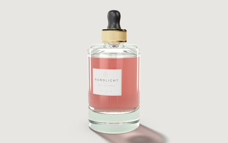
Own demo · fictional product
Cosmetics bottle
A serum bottle with glass, content, cap and label: for design reviews, the shop and sign-off.
Read next
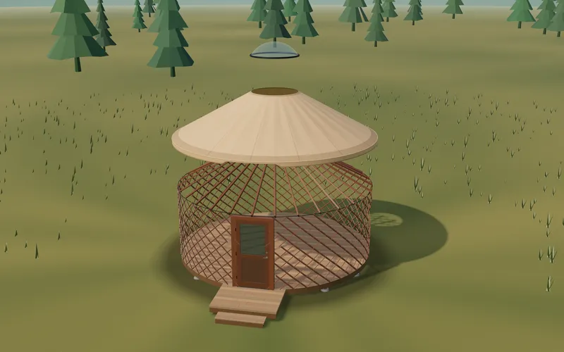
Yurt configurator rules: placing doors and windows on the lattice wall
The rules a yurt configurator needs: wall length per diameter, the space each opening takes, a second door opposite, collision-free dragging, options.
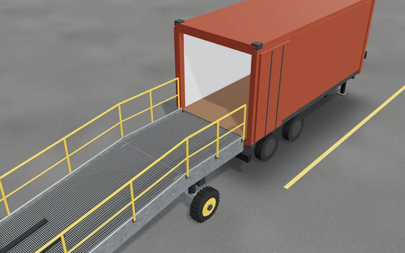
Yard ramp slope, bed height and checks as configurator rules
How a yard ramp configurator calculates slope from length, level-off and bed height, and checks lift range, door opening and forklift clearance.
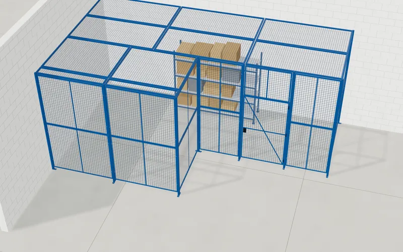
Wire partition planner rules: outline, doors and parts
The rules a wire partition planner needs: outline on a grid, wall lengths, heights, doors and service windows, ceiling and lock, layout checks and parts.